
Friday is a mobile app that helps you make last minute food decisions. A simple tool to save you time, whether you're rolling solo or with a squad.
You're craving something to eat spontaneously, your Whatsapp group can't wait to meet up, but then you get the message...
"So where do we want to go eat?"
To answer this question, I had an amazing time researching, analyzing and prototyping an experience that was full of surprises and tons of food.

It's funny how quickly we feel like going on a spontaneous food run but spend time deciding on a new spot to eat at. At first I thought it was just my group of friends, but surprisingly 8 in 10 people surveyed said, it's a usual scenario with themselves and their groups.
How can we make the decision making process more efficient when picking a place to eat at? (solo or in a group)
A tinder-like experience that narrows restaurant choices based on mood, location, and budget. A mobile app that helps you figure out spontaneous and last-minute plans.
Creating a tool that helps in making decisions is definitely a bit tricky. I needed to begin this journey by working through my design process.
1. Empathize - Who are my users and stakeholders? Can I see the issue from their point of view?
2. Define - Can I identify and paint a picture of the problem? What are the objectives here?
3. Ideate - Time to prioritize whats important. Creating fidelity wireframes to begin visualizing the users journey and shaping the solution.
4. Prototype - Mockups + high fidelity screens to visualize the prior work ready for user testing.
5. Testing - User testing the prototype to gather important qualitative and quantitative data that can help in the rapid iteration of the prototype.
Now that our process is defined, I needed to gain insight into who my users are. Though this problem affects myself and my group of friends a lot, the sample size needed to be bigger. But first, let's create our personas. Who are the most affected by this issue of spontaneous decisions when looking for a quick bite?... University students and working professionals. With a focus on saving time this made the a great foundation to begin the persona creation process.
As my questions to this group of 50 individuals became more frequent, I began to see how much of a pain point this is for them. With some saying, "it takes us all day to decide, we just end of going to the usual place to eat." to "it takes a good 2 hours for us to pick one spot." the answers and problems were apparent.
The objective here is clear, from that group of 50 individuals, what aspects or variables were the most important to them? or better yet, what affect them the most? In a clear choice, it was Cost - too expensive, Distance - too far, Consensus - group agreement and Time - quick decision.


We now know who our ideal users are. It's important for us to keep in mind that this is a decision making tool that needs to save time. The journey of the user needs to be efficient and simple. That means eliminating any distractions and detours on our way to the choice list.
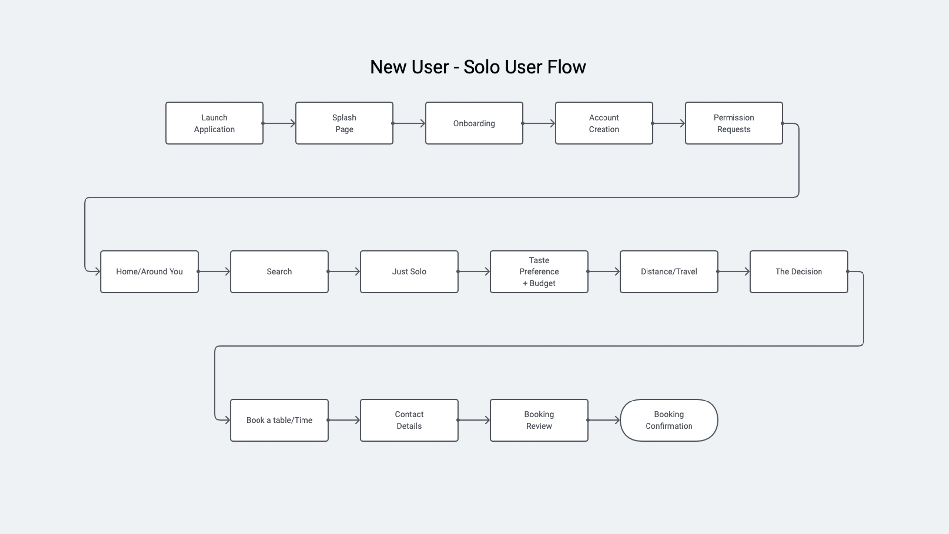
you can never have too many user flows, assisting us and our stakeholders in seeing that many paths and scenarios that a user can take when using the platform. Below I've crafted two flows that focus on a New User - signing up on the platform and going through their first journey to picking out a restaurant and a returning user that is coming back to but this time making a decision with a group to pick out a place to eat.
The path allows the user to either see all of the choices on the main home feed, or select the constraints before being presented the choices.
During the user testing, it was pointed out that figuring out the budget and taste preference mattered the most when going out with groups and distance and budget mattered the most when find something solo.

The information architecture of Friday had to follow the same principle of the user flow, a simple and straight forward experience without distractions and detours.
The structure focused on guiding you through the decision making process and getting you to your destination. At first, the initial Information architecture did not include payment within the platform, a simple discovery tool. But, as testing continued, it was apparent that users felt more comfortable to book the table from within the platform.

The workflow came together nicely, with the participants giving their inputs every step of the way. The wireframe, using simple card style layouts offered a simple solution to create a quick and easy experience.
Once the constraints are selected by the user, a tinder-like experience for selecting the remaining places to eat helped to narrow down the decision. This helped the users in both a solo or group experience. The group experience offered an opportunity for every one to give their inputs.
In this design, I wanted to bring about a more conversational style design to really be an extension of their WhatsApp, iMessage, facebook group convos. A balance of text and cards was key in making this experience seamless.


The Friday experience, similar to its name and day of the week, should be able to alleviate the pains of decision making and be a fun experience when using with a group. The journey of the user should start from their surrounding. A carousel helps to quickly identify options nearest to the user. As the user begins the search, the journey expands and gets more refined as more information is added.
Imagine telling asking your friends, "what're you in the mood for?" or "let's grab a bite somewhere close!", what is a usual conversation, becomes simple search filters that help make the process more accurate.
During the user testing of this prototype, it was interesting to find that users were excited to find a budget option that was tailored to the type of food they were in the mood for.
When creating an experience such as this, there was a constant reminder to always speak to the other side, the restaurants. Though we're creating an experience for the user to eat there, the restaurants also play a key role in making this a success. During the user research for restaurant owners, I found a consistent theme. One owner summed it up nicely, "whatever you do, the important thing here is to drive traffic in here." This was extremely important. The hook.
Going back to the value propositions, I had to look at it from two perspectives. The customer and the owner. two value propositions paired perfectly when asked to both sides, Cost and quick decision. The cost needs to be enticing enough for the user to come into the restaurant and the establishment to serve it still with a profit, and a quick way to make a decision for the user to save time and for restaurants to keep the flow coming and going.
A simple solution to this problem was a "happy hour" style promotion within the experience to promote flash sales. Though the margins of restaurants already being low, it was seen as an interesting promotion tool as it would help fill more seats and the establishment can up-sell other items during the time the customer is seated. On the users side, this was really well-liked. This option allowed for them to go at a time where they felt they would save and still get a good bite. The university students really got behind the expereince.

The decision making process of Friday needed to be simple and basic. As mentioned before, it needed to mimic the conversations you would usually have with your friends. The decision making process begins with the asking if you're starting the adventure solo or with a group.
Once the decision is made, you're able to identify what you're in the mood for. The more tags that are added, it would refine the options to be more accurate. During the user research and testing, it was interesting to find that users preferred to have the budget in the same section as it shows the willingness to spend and the ambiance they're looking to go for.
As the filters are selected, the last step would be to find how far you're willing to go. The distance proved to be a factor that many users consistently had brought up. In larger groups, the farther the distance the harder it was to making plans.
Finally, once all the constraints and filters have been added, the selection of restaurants are summarized in a tinder-styled format to consume the info easily.

The most interesting section of the experience for users was the "choose your squad". This social section provided the option to share your decision making in your existing groups for a collective experience.
The groups can be added to be as personal as you'd like. When asked, do you have a problem making a decision with just one group of your friends? The answers provided a different picture. Many faced problems with 2 -3 different groups, groups from their university, work, even with their significant other (date night!).
The ability to make this decision together made the experience more fun.
As a leader of the group, you begin the decision process. Based on everyones interest, you select the moods and budget, and finally once the collection list of options present themselves, the group is able to vote on the one that they like the most.


1. Don't make it harder than it should be ⏤ It's simple, coming to a decision is takes logical steps and reasoning. I definitely agree that this was a more watered down version of a decision making process, but the logic and foundation was built on top of the experiences of the users during this process. I would definitely like to spend more time in creating an experience that's even faster.
2. Partnerships ⏤ The Friday experience though simple, can be combined with different existing platforms such as Opentable and other from bookings, and more. There are definitely steps that can stripped away to compliment other experiences.
3. Can this be built in other touch points? ⏤ During the course of this experience, I saw many opportunities where Friday can be added instead of it being a standalone app. An example would be a Facebook Messenger app. The decision making process can certainly be accomplished within that environment. There are different forms that this solution can be built in, but it also comes with its own challenges. (Restaurant's perspective)